Email builder
An email template is a name, a subject, and a layout of blocks. Open one from Communications → Templates, or create one. See Create a template.
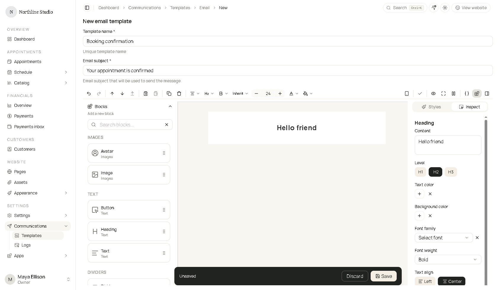
Name and subject
Template name is required and must be unique. Customers do not see this name. You use it when an app asks which template to send.
Email subject is required. It is the subject line of the email. It can include placeholders such as {{customer.name}}. The same expressions work in the subject and inside text blocks. See Using template expressions. The help under the field says this subject is what gets sent.
Clone (top right on an existing template) copies the template into a new one.
Toolbar
The bar under the subject is the builder toolbar.
On the left, with a block selected:
| Control | What it does |
|---|---|
| Undo and redo | Step backward or forward. |
| Move up and move down | Change the order of the selected block among its siblings. On Windows, Ctrl and the arrow keys do the same. On a Mac, use Option and the arrow keys. |
| Move out | Lift the block out of a container into the parent, when it is nested. |
| Duplicate | Copy the selected block. |
| Delete | Remove the selected block. The email layout itself cannot be deleted. |
| Block formatting | Font, alignment, and the other controls that belong to that block. A Text block also shows bold, italic, and the rest of the text toolbar. |
On the right:
| Control | What it does |
|---|---|
| Desktop and mobile widths | Preview the email at a wide or narrow width. |
| Preview | Switch between editing and a read-only preview. |
| Full screen | Use the whole window for the builder. |
| Pause | Turn canvas animation off or on. |
| Braces | Open the sample data for placeholders. Copy a path from a value when you need the exact name. |
| Blocks | Show or hide the Blocks panel. |
| Inspector | Show or hide the right-hand panel. |
Blocks panel
Blocks lists everything you can add. Search filters the list. Each card is dragged onto the canvas. The handle on the right of the card is the grip. Drop the block where the canvas shows a gap.
Categories:
| Category | Blocks |
|---|---|
| Images | Avatar, Image |
| Text | Button, Heading, Text |
| Dividers | Divider, Spacer |
| Containers | Container, Columns container, Conditional container, Loop container |
| Layout | Custom HTML |
| Online meeting | Online meeting |
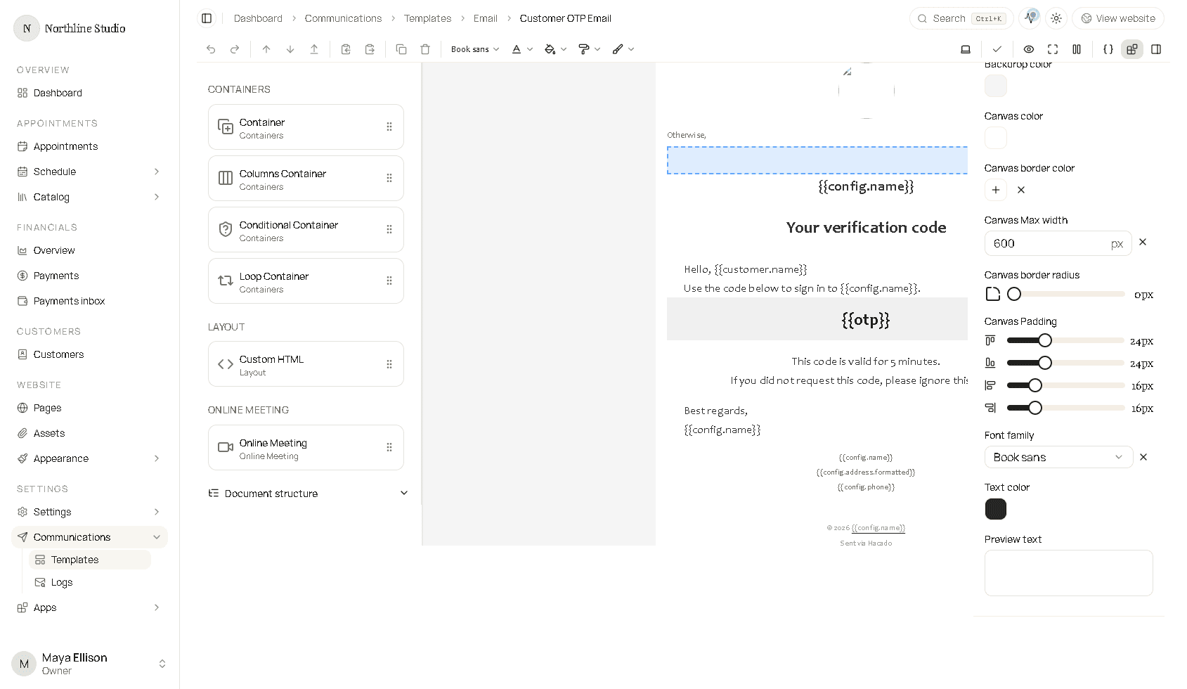
Document structure at the bottom of that panel is the outline of the email. Use it to select a block that is hard to click in the canvas, including the Email layout. The selected row is highlighted.
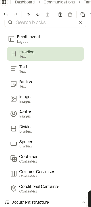
Each block’s fields are on their own page under Email blocks.
Canvas
The center is the email. Click a block to select it. The breadcrumb above a selected block shows where it sits, such as Email layout / Text.
A text block opens an editor on the canvas: undo, redo, the block type, font size, bold, italic, underline, strikethrough, and alignment.
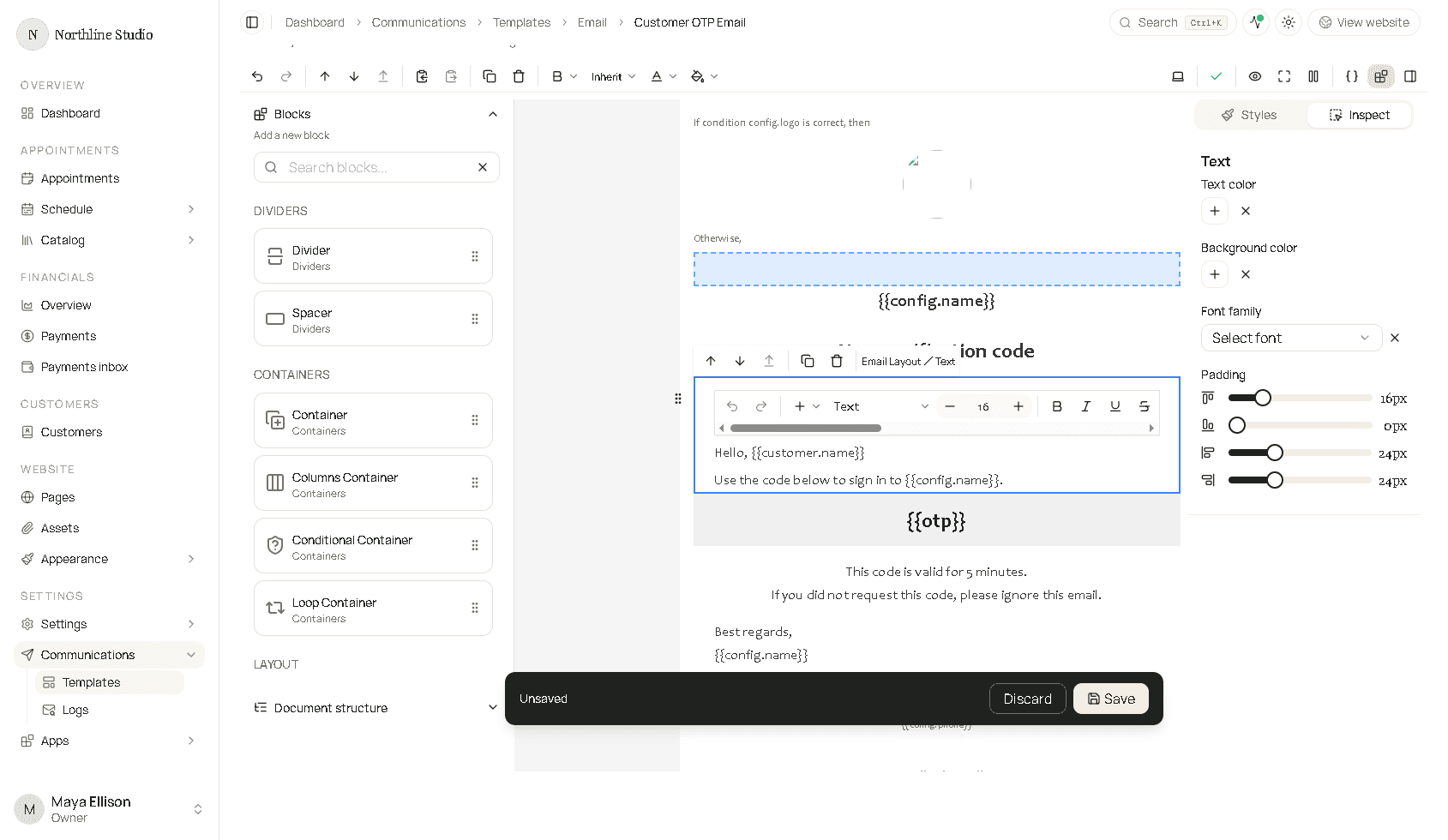
If you change something, a bar offers Discard and Save. Discard throws away edits since the last save. Save writes the template. Leaving the page with unsaved edits asks you to stay or leave.
Inspector
The right panel is the inspector.
- Styles is always the Email layout: backdrop, canvas, default font, and preview text. It stays on the layout even when another block is selected.
- Inspect is the block you selected. Its title is the block type (Heading, Text, Button, and so on).
- Color fields have a swatch, a clear control, and sometimes a reset.
- Padding is four sliders: top, right, bottom, and left.
- Font family lists faces such as Modern sans, Book sans, Book serif, and Monospace. Inherit on the toolbar keeps the font from the email layout.
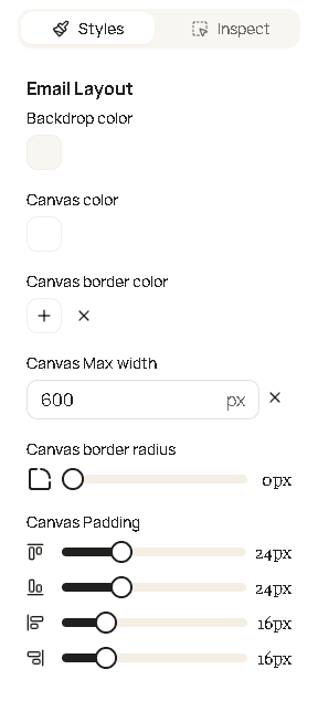
The email layout is selected when you have not clicked a block inside it. Its fields:
| Field | What it changes |
|---|---|
| Backdrop color | The area outside the message card. |
| Canvas color | The message card background. |
| Canvas border color | The line around the card. |
| Canvas max width | How wide the card is, in pixels. It must be a whole number from 500 to 1200. |
| Canvas border radius | How round the card corners are. |
| Canvas padding | Space inside the card. |
| Font family | Default font for the email. |
| Text color | Default text color. |
| Preview text | The short line some inboxes show next to the subject. Customers do not see it as a paragraph in the email. |
Style controls that repeat on blocks:
| Control | Meaning |
|---|---|
| Text color | Color of the words. |
| Background color | Fill behind that block. |
| Border color | Line color, where the block has a border. |
| Border radius | Corner roundness. |
| Font family | Typeface. |
| Font size | Size of the words. Must be a whole number greater than 0 when you type one. |
| Font weight | How heavy the type is. |
| Text align | Left, center, or right. |
| Padding | Space inside the block. |