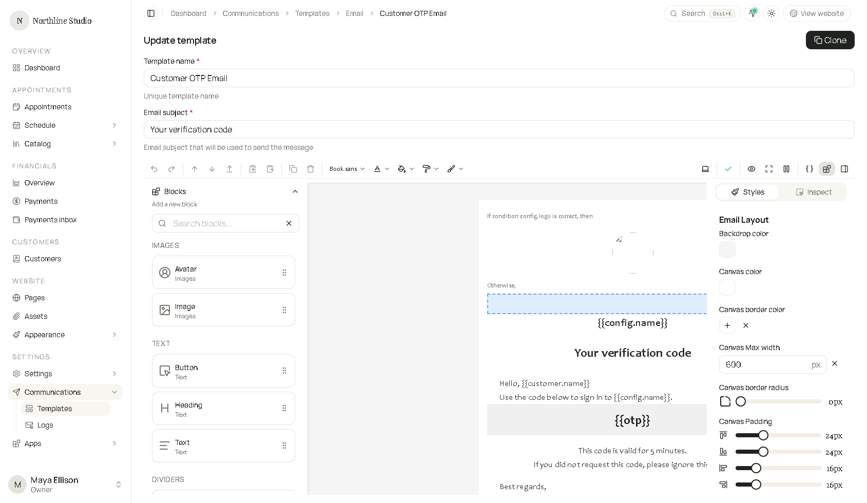
Email blocks
Drag a block from Blocks onto the canvas, then select it and use Inspect. Shared style controls (color, font, padding, alignment) are explained on the Email builder page. The list below is only the fields that belong to that block.
| Block | Use it for |
|---|---|
| Email layout | The card around the whole email. It is always there. |
| Heading | A title. |
| Text | A paragraph. |
| Button | A link that looks like a button. |
| Image | A picture. |
| Avatar | A small profile image. |
| Divider | A horizontal line. |
| Spacer | Empty vertical space. |
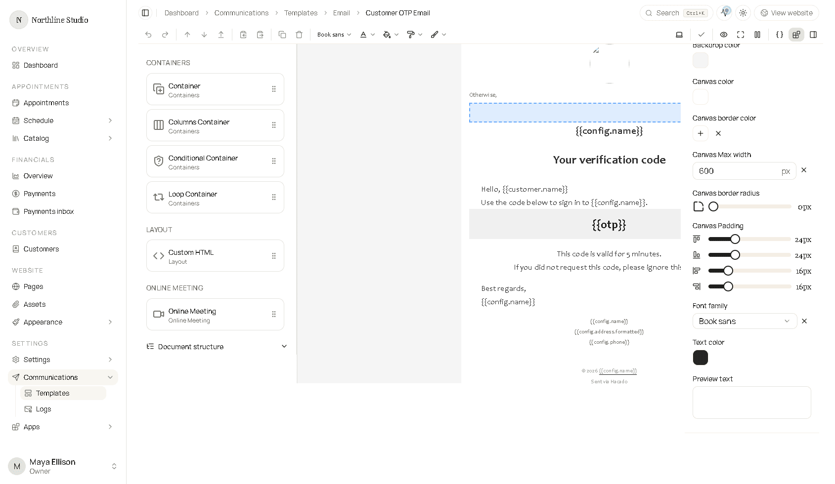
| Container | A box that holds other blocks. |
| Columns | Two or three columns. |
| Conditional | Show one set of blocks or another. |
| Loop | Repeat inner blocks for each item in a list. |
| Custom HTML | Your own HTML. |
| Online meeting | Join details for a video visit. |
The blocks panel, with images and text at the top and the rest of the list under it: